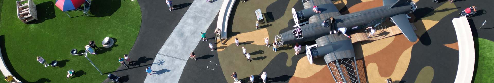
Our 2026 in Colour
Our 2026 in Colour is informed by the RAL COLOUR FEELING 2026+ report. Rather than treating colour as purely visual, we looked at how it reflects wider social, emotional, and behavioural shifts, and how those ideas can be applied in practical, meaningful ways.
We translated the key themes into a colour approach specifically for play environments, focusing on how colour can help shape the way a play space is used and experienced.

Using Colour to Shape Play Spaces
Colour plays a key role in how a play space is experienced, but it is often considered late in the design process. The colours used on equipment, surfaces, and structures can influence how children move, interact, and feel within a space, often without them even realising it.
Thoughtful colour choices can support different play behaviours, create clearer and more engaging environments, and help make play spaces feel welcoming and inclusive for everyone.
Six Colour Approaches for Play:
Mediating
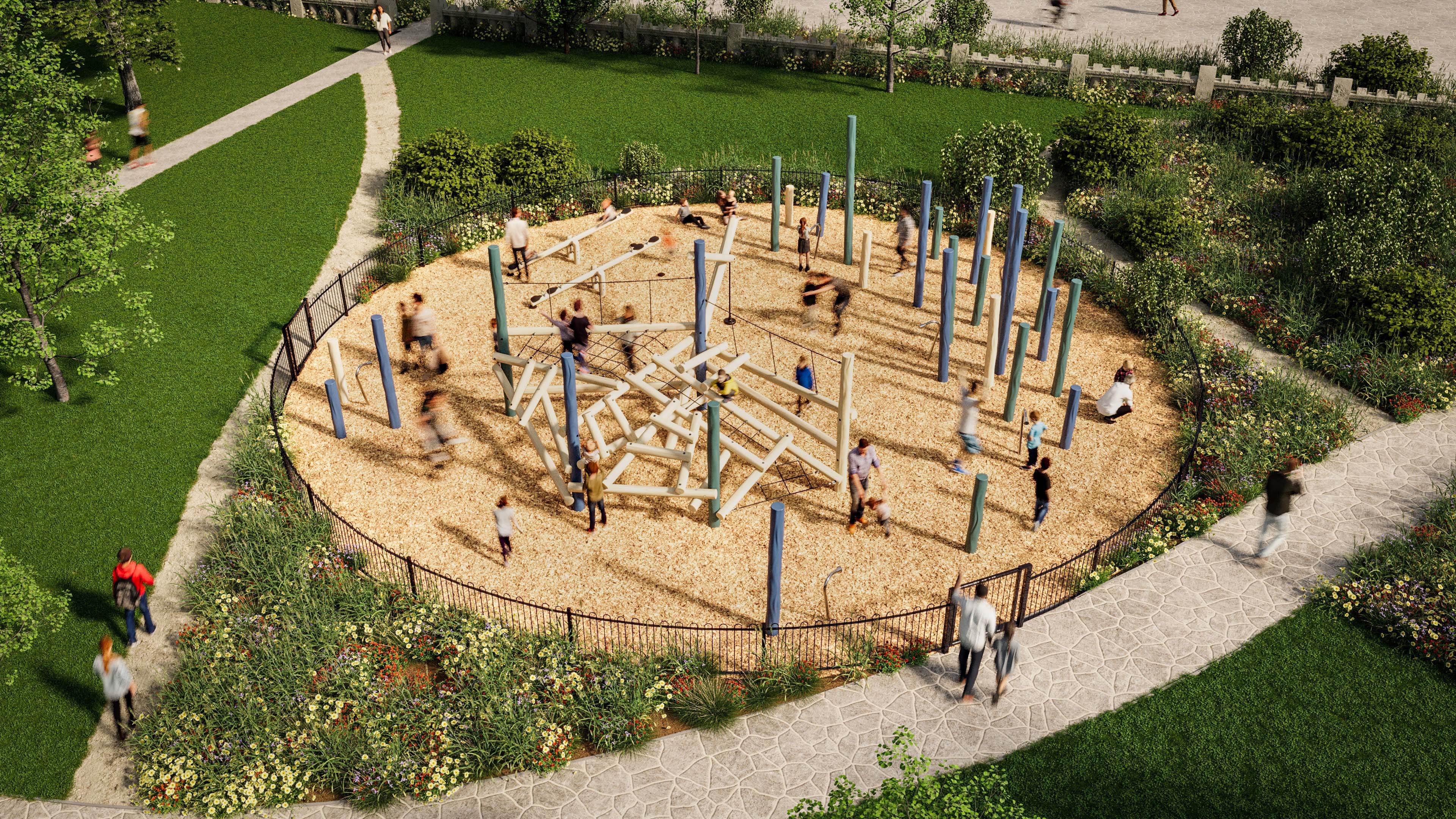
Mediating colours help create grounded, reassuring spaces that support shared and inclusive play. These tones work well on larger structures and accessible equipment, where clarity, stability, and comfort are important.
They help reduce visual noise and support social interaction, observation, and moments of rest within busy play environments.

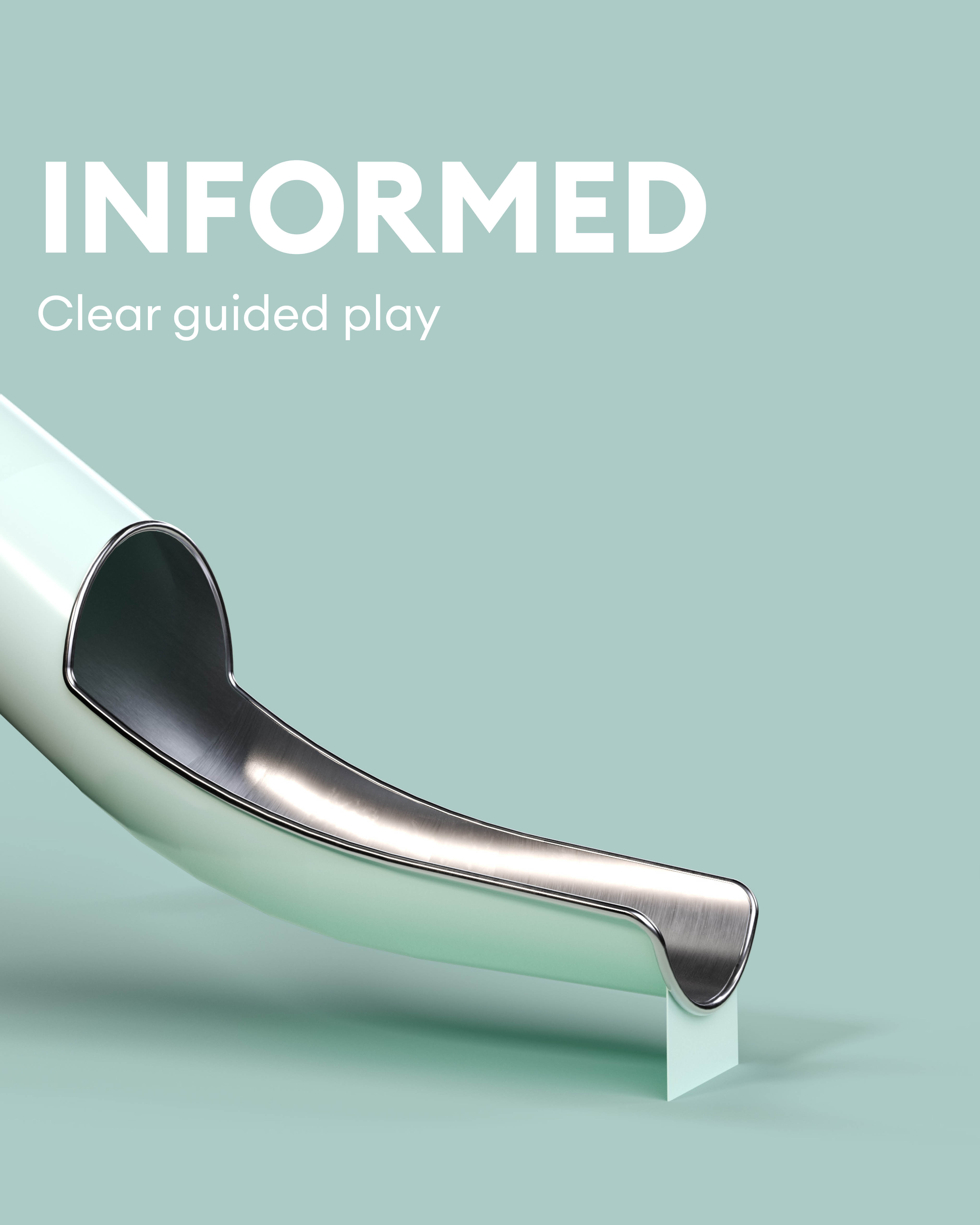
Informed
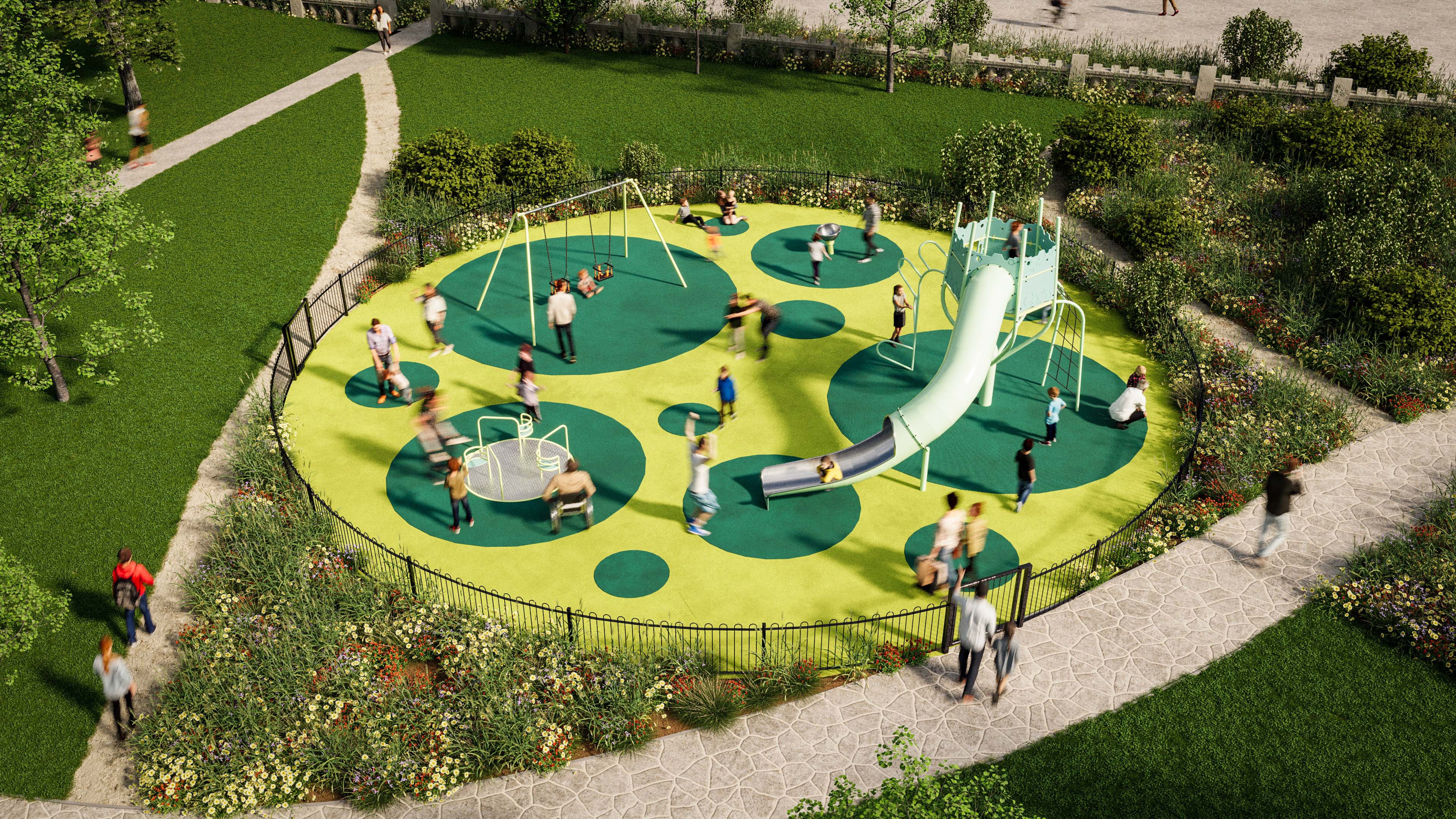
Informed colours support movement, flow, and understanding. Lighter, clearer tones can help guide children through equipment such as slides and transitional elements, building confidence and supporting cause-and-effect play.
These colours work well where direction and clarity matter, helping play feel intuitive and accessible.
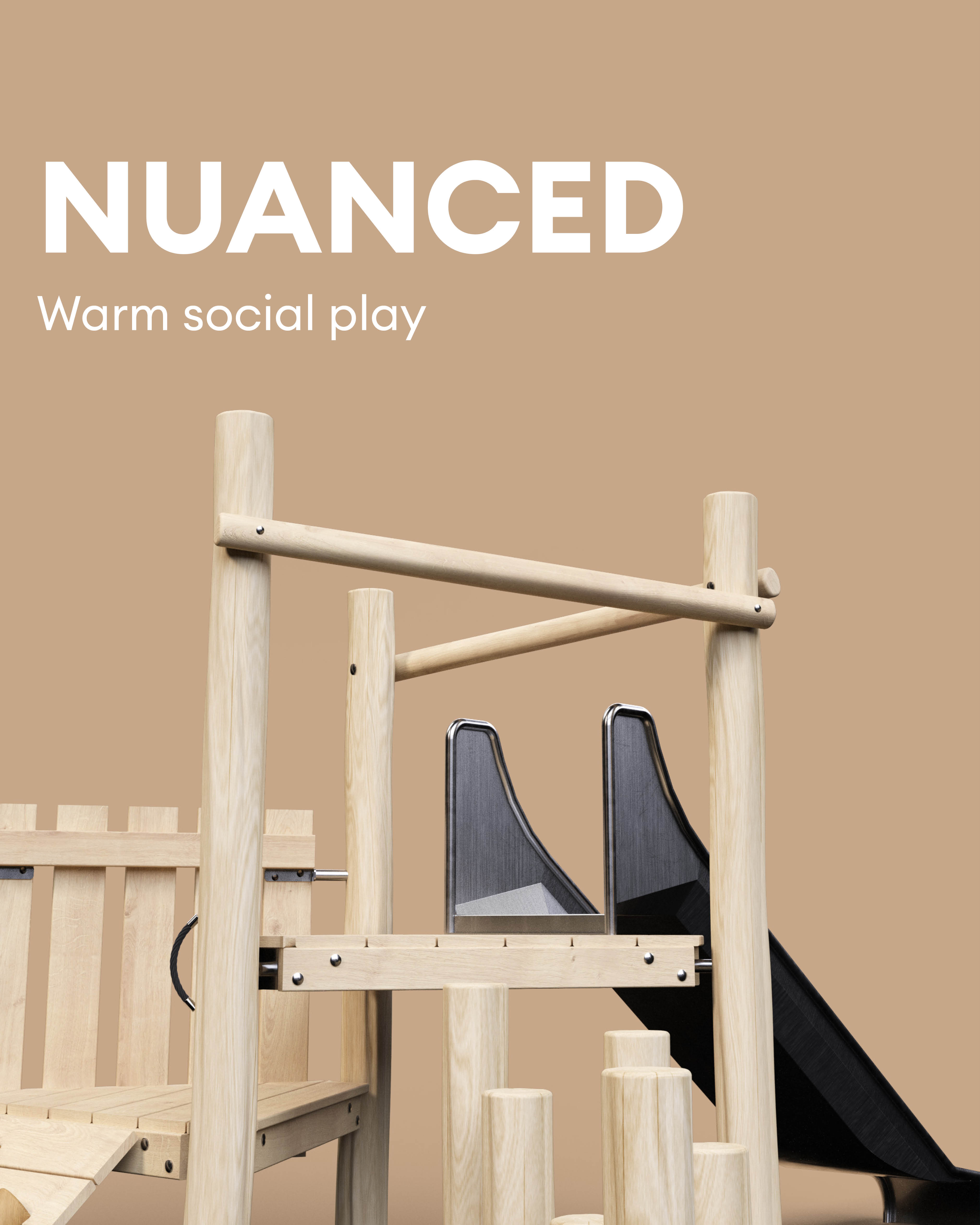
Nuanced
Nuanced colours draw on warm, natural tones that feel approachable and human. They pair naturally with timber and tactile materials, making them well suited to equipment that encourages balance, imagination, and social interaction.
These colours help create spaces where children feel comfortable spending time together and engaging in shared play.
Focused
Focused colours are bold and energetic, designed to draw attention to active play elements. Used on spinning equipment, climbing features, or dynamic structures, these colours help signal movement and physical challenge.
They support confidence-building play and help define high-energy zones within a wider play space.

Open
Open colours support flow, freedom, and exploration. Often drawing on cool blues and greens, these tones work well across swing frames and movement-based equipment that allows open-ended use.
They help connect different parts of a play space and encourage rhythmic, sensory movement.

Adaptive
Adaptive colours are expressive and engaging, supporting imaginative and sensory experiences. These tones work particularly well on sound, communication, and sensory equipment, where curiosity and creativity are key.
They help create inclusive spaces that encourage exploration, communication, and emotional development.

Using Colour Early in the Design Process
One of the most important lessons in play design is that colour works best when it is considered early. When colour is introduced as part of the overall design thinking, it can help define zones, support different play behaviours, and create spaces that feel more intentional and inclusive.
Rather than being a finishing touch, colour becomes a design tool.
2026 in Colour is not about a fixed palette. It’s about using colour with purpose, confidence, and care.
Practical Application
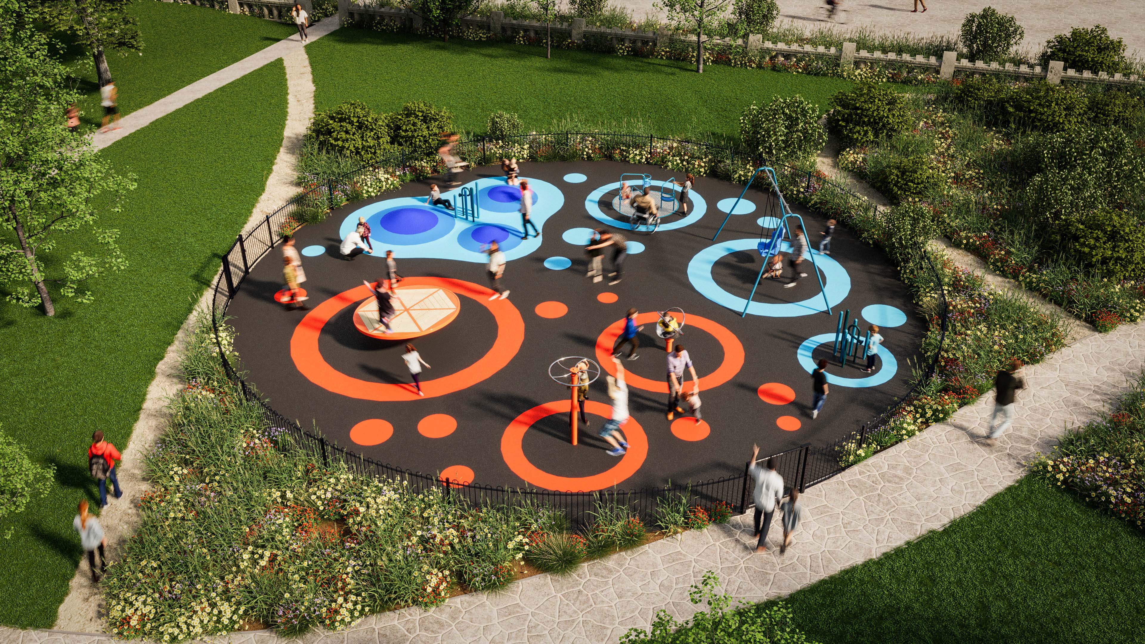
Using combinations of colours from the 2026 in Colour palette, play spaces can be designed to support a wide range of play behaviours and experiences.
Focused + Mediating
Combining Focused and Mediating colours helps create play spaces that balance energy and calm. Brighter tones can highlight areas of movement and physical challenge, while softer colours support shared play and accessible equipment.
Together, they create spaces where active play and quieter social moments can comfortably exist side by side.

Nuanced + Adaptive
Nuanced and Adaptive colours work well together in spaces that encourage imagination, sensory exploration and social interaction.
Warm, natural tones pair naturally with timber play equipment and tactile materials, while more expressive colours help highlight interactive features and sensory elements. The result is a space that feels welcoming, playful and rich in opportunities for creative play.

Open + Informed
Open and Informed colours help create play environments that feel clear, connected and easy to navigate.
Cooler tones support open movement and exploration, while lighter guiding colours help define routes through equipment and support confidence-building play. Together, they create spaces where children can move freely while still feeling oriented and supported.

Inspired by RAL COLOUR FEELING 2026+
This resource is informed by the RAL COLOUR FEELING 2026+ trend research, interpreted through the lens of playground design and play behaviour.
Our aim is to explore how colour can move beyond decoration and become a meaningful tool for shaping how play spaces look, feel and function.
If you’re planning a new play space and would like to explore how colour can support play behaviour and experience, we’d love to chat!
Give us a call on 0161 480 5243 or email sales@masseyandharris.com