This information was accurate when we published it - this article was published in June 2025.
We've had a glow up!
Our visual branding has a great new look. It's more friendly, more empathetic and more Massey and Harris.
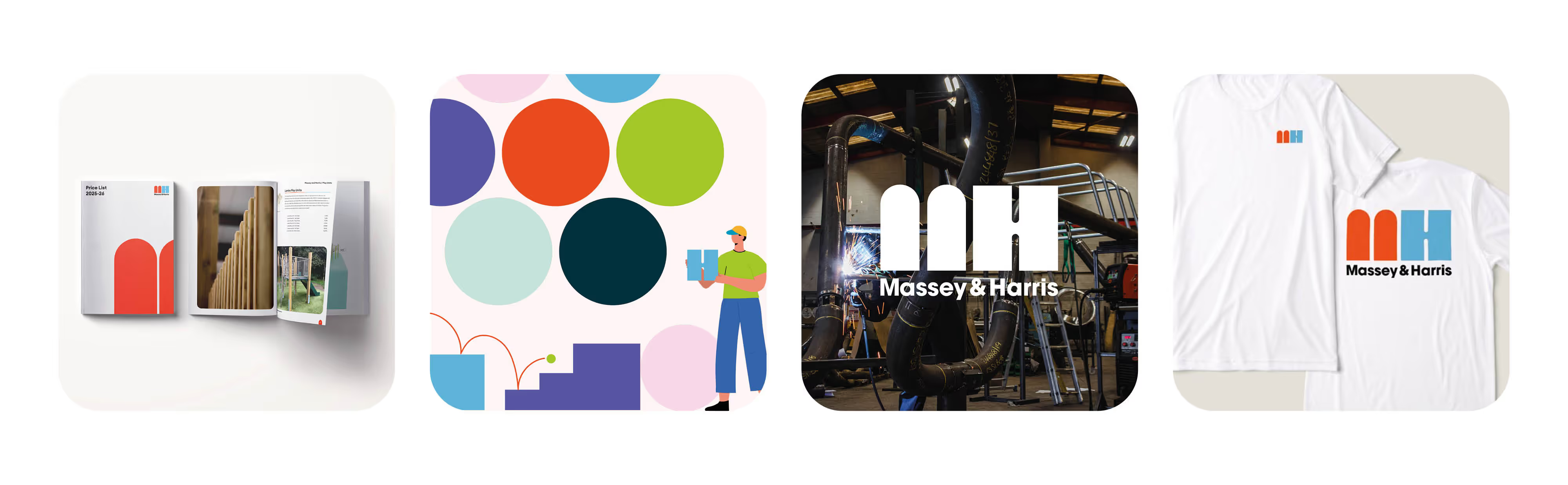
We've worked on our logo to provide a new, minimal approach doubling down on our new colour palette. We've brought in new typography and a new visual direction and photography. We're developing new illustrations which you'll see more of as we release new content.
An identity that's ready for what's next
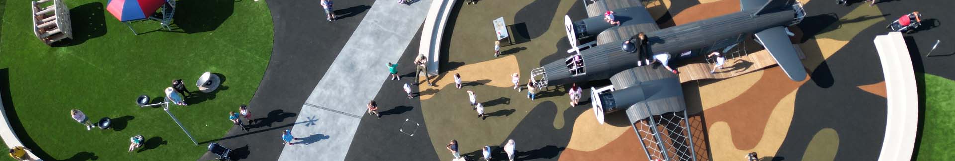
We design and manufacture play equipment. Our logo and branding had to reflect that. Play shouldn't be stuffy and boring. It should ooze fun and character. Enter Massey and Harris and our new look. We like to think that we've brought a new sense of optimism and awe and amazingness to play. We've tried to bring new forms to the front with our new logo and illustrations. We want to come across as human and not a corporate company that sucks the fun out of play. These are the principles that we've worked hard with to get us to this new amazing look.
"The new look brings a real breath of fresh air to the play industry. The clear intent of the identity and branding allows us to grow whilst appreciating our roots and heritage."
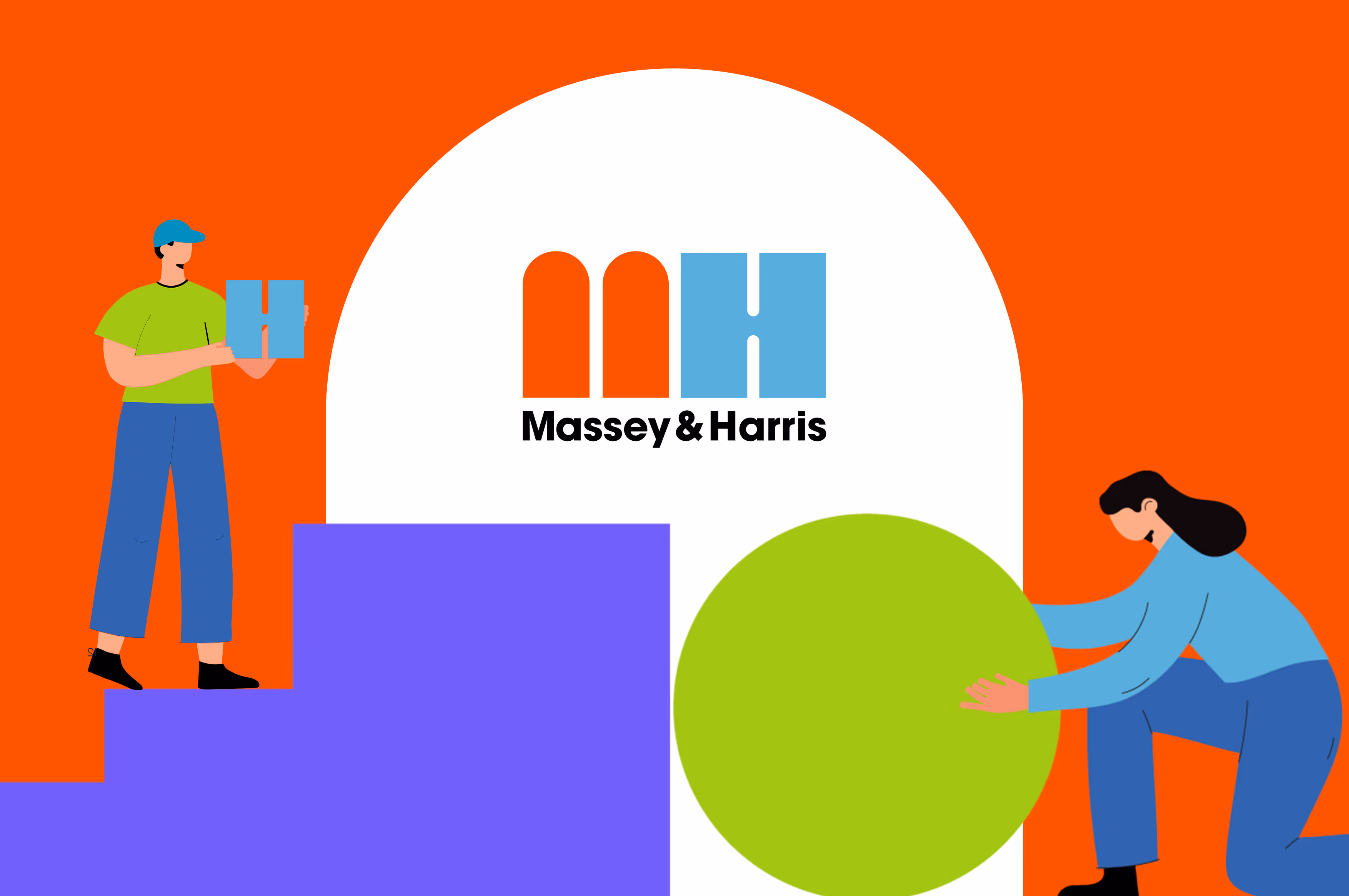
Our New Logo
We've worked on a new logo that's going to be recognisable across the industry. We've distilled it into a simple form that nods to our heritage of being built and raised in Stockport. The double arch M relates to the famous Stockport arches of the railway viaduct; positioned alongside our new H form which symbolises our robust strength and dependability.
Colour
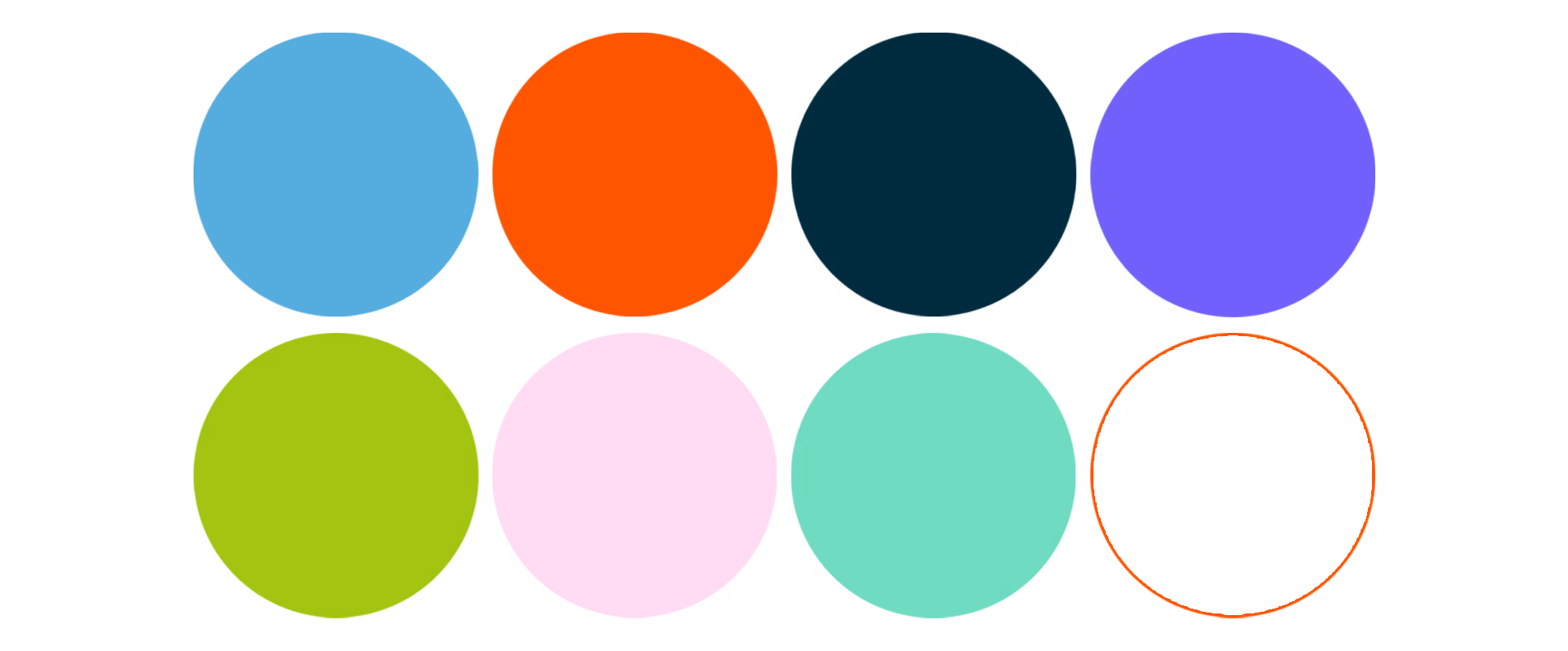
Our colour palette has matured from our old primary colour offering to a new distinctive colourway. The pairing of the new Orange and Blue keeps us distinctive. Both colours complement each other with orange leading the charge in creativity, enthusiasm and warmth with blue offering trust, stability and calm.
We've expanded on our colour palette and we have a great range of secondary colours to support our primaries and they offer help and support when needed.
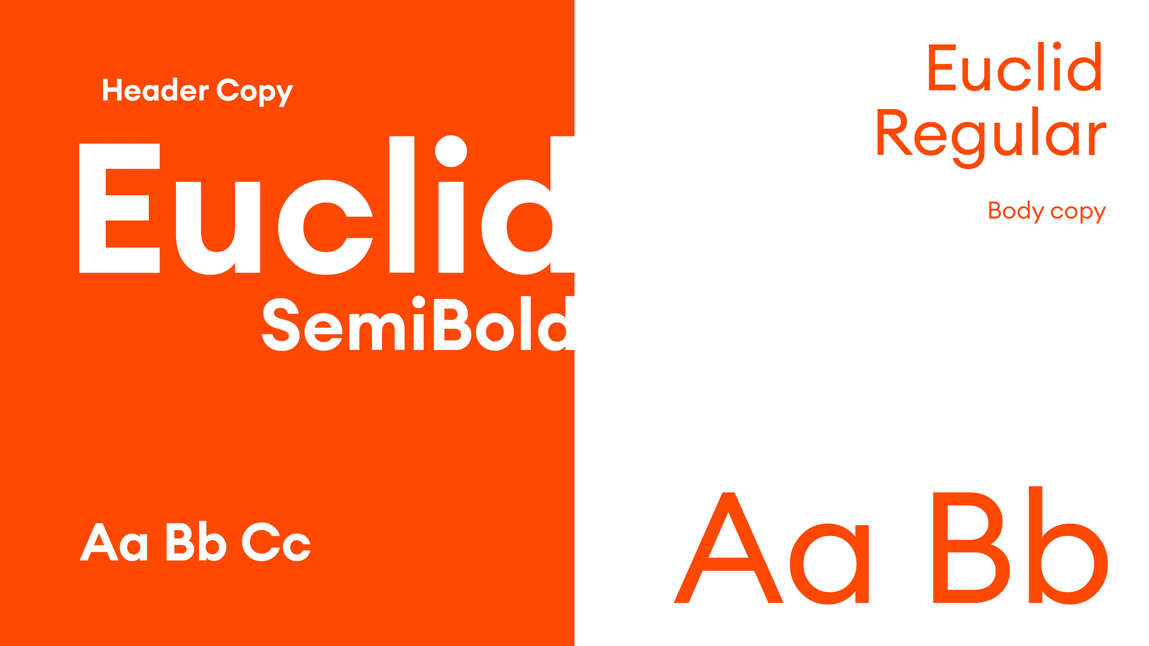
Typography
We've picked Avant Garde for our hero typeface on our Logo. It appears below our custom logo and also features as our Secondary Logo. We've gone with Euclid for our functional typeface. We've picked it due to it's generous sweeping forms and high readability.
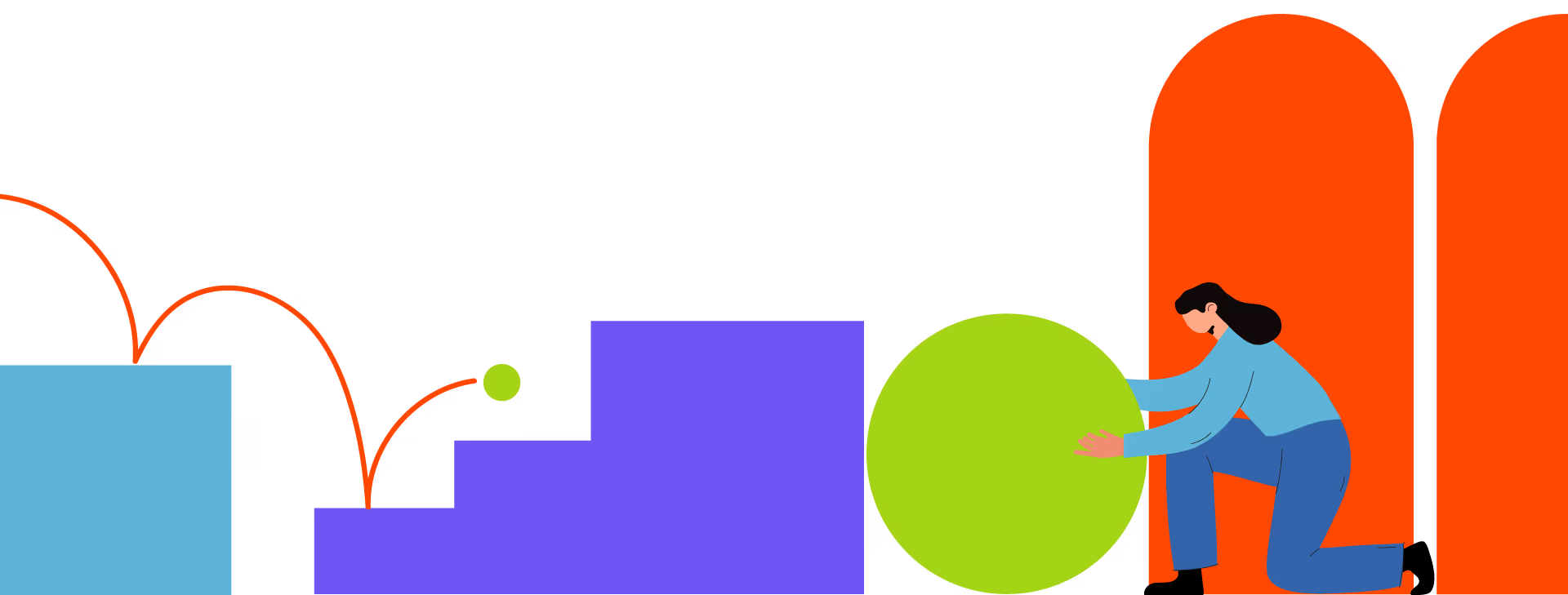
Illustations
We've moved away from boring generic illustrations and decided to create illustrations that bring character and personality. The illustrations should tell a story and you'll see more of these as we role the branding out across more channels.
The Next Step...
We're really proud of the branding work that's been carried out and the creative team have shone in bringing the fun to play and to our companies brand. Our next task is bringing it to our marketing efforts and seeing it applied to our sub-brands.
We hope you love it as much as we do... Keep your eyes peeled for more.